Writers know there are plenty of things they’ll ultimately need for their marketing efforts. And the author photo often strikes fear into many hearts, despite it being one of the most important.
But Icy! I hear you cry. Surely the books are far more important?
Meh. Yes and no. Plenty of people will buy books based on snazzy covers or cool hooks. So get those sorted and you’re laughing.
It’s just you will find it so much easier making connections with people if they can see your face. Don’t blame me, blame neuroscience. Humans are wired to respond to other faces.
Now I know that professional photography is probably out of your price range until you start earning a regular amount. And unless you have a photographer in the family who wants to do them ‘for practice’, or you know photography students who need to build a portfolio, you might wonder what to do about it.

Last week, we talked about getting your author brand right on social media.
This week, I’m going to show you how to edit your author photo using just a smartphone.
First off. Some general photography tips.
Most smartphones are good enough to rival mid-range SLRs for general snaps. But they still have their pitfalls – notably around zooming. The zoom on an SLR is an optical zoom, so you get much better quality. The digital zoom on a smartphone often gives you pixelation.
And no one wants that.
So if you’re getting someone else to take your author photo for you, get them to physically move closer or further away to frame you. Don’t use the zoom.
Next, try and take your author photo outside. Don’t worry if it’s overcast – that just means you won’t have harsh lighting to contend with. But natural light is pretty much the most flattering lighting there is, which means easier editing later.
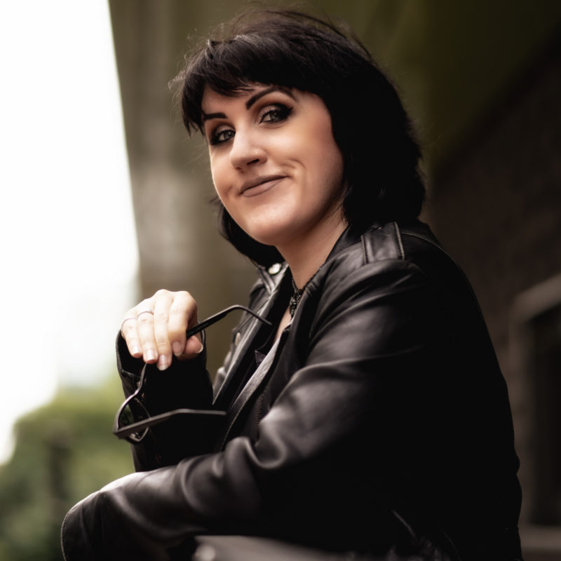
Caveat: I’ve taken my author photo as an example under electric lights, but that’s because it was foggy as all hell this morning and I didn’t want a photo that looked like something out of Dickensian London.
Your background is important. You want something basic that doesn’t detract from you. Bookshelves can be nice if you’re beside a window. Or your garden can be a good choice if you have a nice view behind you.
Just don’t choose a background so overwhelming the viewer looks at it before they look at you.
I chose a white breezeblock wall for my example image to demonstrate the point. It’s too blank, but it shows up the edits.
You don’t have to just use the same author photo. By that, I mean you can have a different image that you use on your website’s about page to the ones you use on social media.
Social media photos often end up being head-and-shoulder shots. Which is what we’re covering today. But your ‘about page’ photo can be something else.

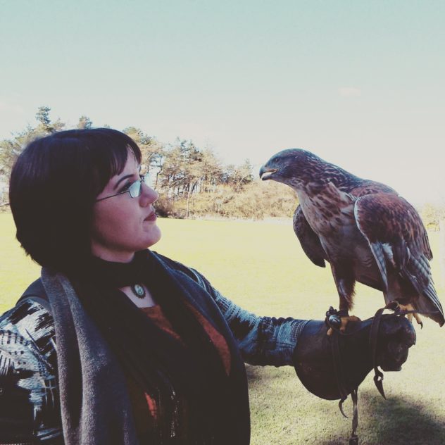
This is me with a hawk named Rusty from a falconry day I did last year. I use it because a) hawks are cool and b) it shows a bit of personality.
Remember that whole ‘connecting with people’ thing? Yup. The imagery you choose is totally part of your author brand.
Hint: Your brand is what people think of when they think of you.
Let’s get on with the editing.
I’ve filmed a walkthrough using my smartphone but I just wanted to say a couple of things first. I use a Samsung Galaxy S6, but even if you’re an Apple user, the principles are the same.
If you’re doing a selfie – as I did – make sure you’re smiling. And look right at the camera. People like seeing smiles. And again, neuroscience is on your side. If you see someone smile, you can’t help smiling back. And that sets off a whole load of positive associations in your brain.
So you form a better connection with the person and you spread a little happiness. Win win.
I just use the default camera app with the Selfie mode on the front-facing camera. And I use Snapseed to edit with. It’s completely free and it’s available for both Android and iOS. It’s brilliant and I highly recommend it.
You can crop images to fit a certain ratio (i.e. square for use on Instagram) or use the cropping grid to make sure your lovely face is in the middle…unless you’re being arty and you want to be off on one side.
But for simplicity sake, let’s start off with a face-centered image.
How to edit your author photo using just a smartphone from Icy Sedgwick on Vimeo.
See? Snapseed comes with a plethora of image-editing options. You can add filters, vignettes, and other special effects. I’ve just shown you the absolute basic image edits you’ll need to tune your image.
So you can get a perfectly decent author photo for absolutely free!
If you’re still struggling with this whole ‘author brand’ thing, then sign up for my free 5-day email course below. We’ll get you on the road to a fun and relevant author brand!
Over to you! Post your author photo in the comments so I can say hello!
Confused by this author brand stuff?
Get some clarity and get stuck into fonts, colours, and the reason you need an author brand in my free 5-day email course. By signing up, you also consent to receive occasional emails of useful tools, resources, and fun stuff for writers!


[…] easier than ever before to do a lot of it yourself. From taking your own author photos to creating websites, you can (and should) take control when you start to create a successful […]